

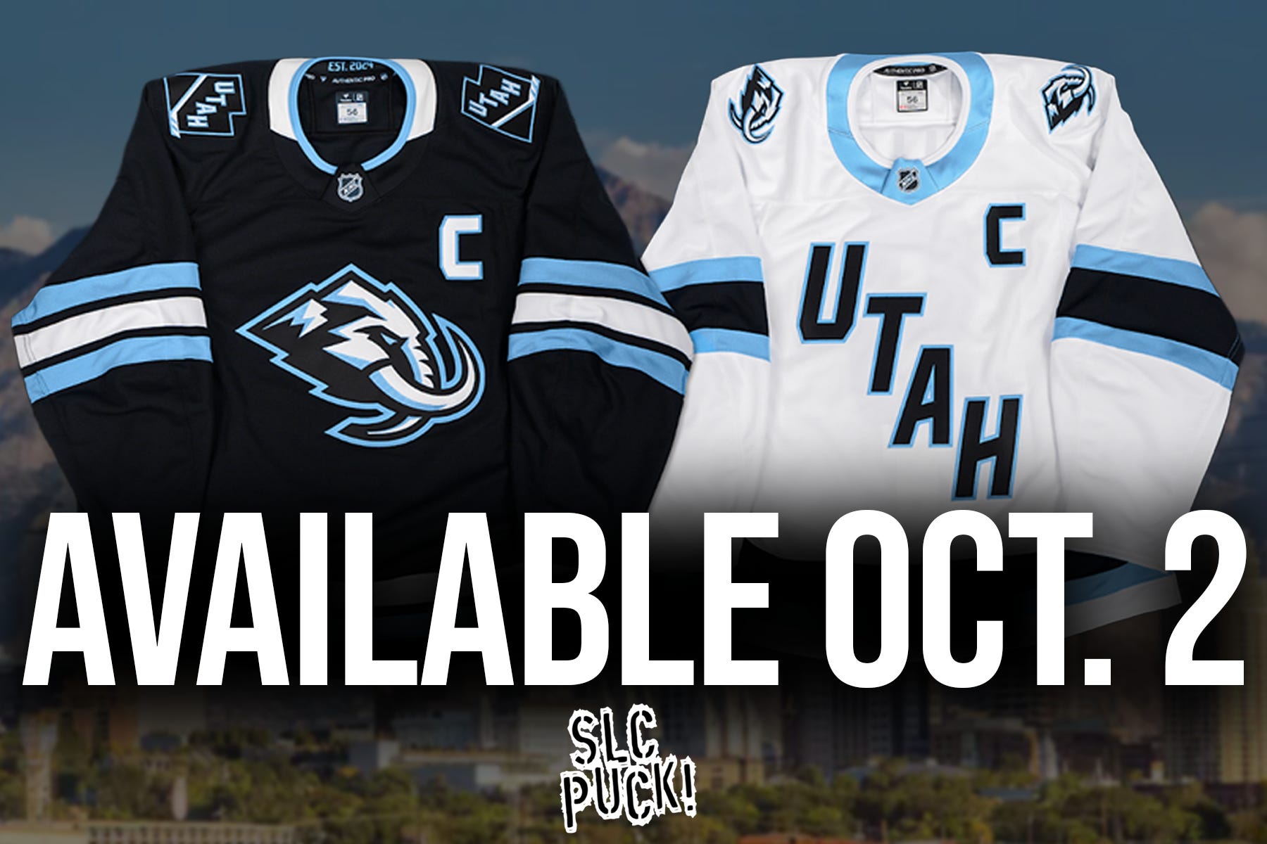
The wait is over. The Utah Mammoth announced on Wednesday that the team’s first-ever jerseys will officially be available to fans starting Oct. 2 at 11 A.M. MT, just hours before puck drop of the Mammoth’s preseason opener vs. the LA Kings at the Delta Center.
Jerseys will be on sale at the Delta Center Team Store, MammothTeamStore.com, and NHLShop.com . Both the home (black) and away (white) sweaters are included in the first wave, with Fanatics Premium and Breakaway editions available.
TL;DR
On-sale date: Oct. 2, 2025 at 11 A.M. MT
Where to buy: Delta Center Team Store, MammothTeamStore.com, NHLShop.com
Guaranteed in hand: By the Oct. 15 home opener vs. Calgary Flames
Styles available: Home (black Mammoth crest) + Away (white diagonal UTAH) in Premium and Breakaway editions
Restocks: Additional adult & youth sizes rolling out through late 2025
Utah Mammoth Jersey Release Date (What We Know)
One of the most searched terms for the Utah Mammoth, (which is the main reason I’m putting this blog post up on SLCPuck.com), is “When will Utah Mammoth jerseys go on sale?” I’ve even wondered it myself. While a big update on the timeline is very exciting I’m worried and for good reason.
Why? Well, my wallet is hurting. The Utah Hockey Club got me on the hook for so much merch last year, I’m terrified to see what’ll happen to my credit card statement this season — no, the basement-based podcast money hasn’t been rolling in yet. Still, I will get a new Mammoth jersey, credit scores be damned.
At media availability last week, Chris Armstrong teased a preseason launch. Today we’ve got the receipts: jerseys hit the shelves Oct. 2 at 11 A.M. MT. That’s the same day the Mammoth host the LA Kings in the Delta Center’s first taste of preseason hockey. Fans can roll straight from checkout lines to their seats in brand-new gear.
Time to apply for yet another credit card, I guess.
Mammoth jerseys are (almost) here
At Wednesday’s media availability, President of Hockey Operations Chris Armstrong said the plan is to have retail jerseys available in the preseason and certainly in hand by the Oct. 15 home opener. Translation: you should be able to rock the fresh Mammoth look inside the Delta Center as early as the two home preseason games (Oct. 2 vs. LA, Oct. 4 vs. San Jose) — and absolutely for Opening Night against Calgary on Oct. 15.
Key dates fans keep Googling
Preseason at Delta Center: Oct. 2 (vs. Kings) & Oct. 4 (vs. Sharks).
Regular-season home opener: Oct. 15 vs. Calgary Flames.
Where to Buy Utah Mammoth Jerseys
Delta Center Team Store – first chance in person on Oct. 2.
MammothTeamStore.com – the team’s official new shop.
NHLShop.com – for national fulfillment and wider shipping.
Additional retail partners (Pro Image, Lids, and maybe even big-box outlets like Kohl’s — yes, they had them last year) are expected to carry jerseys beginning Oct. 7 .

What Styles Are Available?
Home Jersey (Black): Features the Mountain Mammoth crest, with bold Rock Black base and Mountain Blue accents.
Away Jersey (White): Keeps the diagonal UTAH look, now updated with Mammoth shoulder logos and crisp Salt White base.
Inside detail: “Est. 2024” stitched into the collar, a nod to the franchise’s first year in Utah.
Both jerseys will be offered in Fanatics Premium and Fanatics Breakaway editions on launch day .
How much will they cost?
The team hasn’t posted 2025–26 pricing yet. For context, last season’s Fanatics Premium line ran approximately: $200 (blank), $250 (player), $275 (custom). Expect similar ballpark pricing, but treat these numbers as historical guidance until Mammoth publish the official sheet.
Sizes, Patches, and Rollout Cadence
Adult sizes available first in both Premium and Breakaway cuts.
Youth sizes and alternate fits will arrive in staggered waves through late 2025 into 2026.
Additional restocks are planned, so don’t panic if Opening Night sells through .
Austin’s quick buyer’s guide
Show up early on Oct. 2 if you want guaranteed first-day stock.
Bookmark MammothTeamStore.com + NHLShop.com and refresh at 11 A.M. MT.
Customization tip: Know your name/number combo before ordering; those queues move slow.
Restock mindset: If you miss day one, more waves are coming—don’t feed the scalpers.
Why the timing matters (and why we’re hyped)
This is it: the first true Utah Mammoth sweaters in history. The organization clearly wants a sea of Mammoth jerseys in the Delta Center on Oct. 15. If you held off on Utah HC merch waiting for the “real thing,” Oct. 2 is your shot. Tusks up.
I mean, my god. Look at how beautiful these things are. Don’t they look nice on these handsome young men, Jack McBain and Dylan Guenther?

FAQs (because I know you’ll ask)
“Will jerseys be in the building for the Oct. 2 and Oct. 4 preseason games?”
Yes. The Team Store opens 11 A.M. MT on Oct. 2, hours before puck drop.
“Where exactly should I line up?”
At the Delta Center Team Store on Oct. 2.
“What if they sell out?”
Expect restocks. Additional adult/youth sizes will roll out through the year. Wider retail availability begins Oct. 7 .
“Aren’t the white jerseys the same as last year’s?”
Same vibe, not the same sweater. The road (white) jersey keeps the familiar diagonal UTAH look and the same Rock Black/Mountain Blue/Salt White color scheme, so it’ll feel very close at a glance. But there are updates: refreshed typography, Mammoth-era branding details (including inside-collar elements), and tweaks like shoulder/mark treatments. Think: same bones, new tusks. They’re dope.
“But what if I want to support SLC Puck with some stylish, fan-made gear?”
I’m glad you asked! Check out Big Tusk Energy, our indie fan brand. Clean mammoth-forward designs, comfy hats/tees/hoodies, and merch that keep the show free, the watch parties loud, and the lights on. Grab yours here (free shipping $79+). Not affiliated with the Utah Mammoth or the NHL—just built by fans, for fans.
Hoping the away jersey eventually features the mammoth logo like the home jersey. I like the updated font but the mammoth logo is much cooler, to my eyes, than a word mark.
It’d also be sick if we eventually got an alternate home jersey in the mountain blue with the tusk U. That’d sell like hot cakes, I think.
Either way, super stoked to get my hands on one of these new sweaters. Thanks for the great post.